Lettering differs from fonts by its originality, easily memorable drawing, and it is appreciated for its uniqueness, so called #freehandlettering.
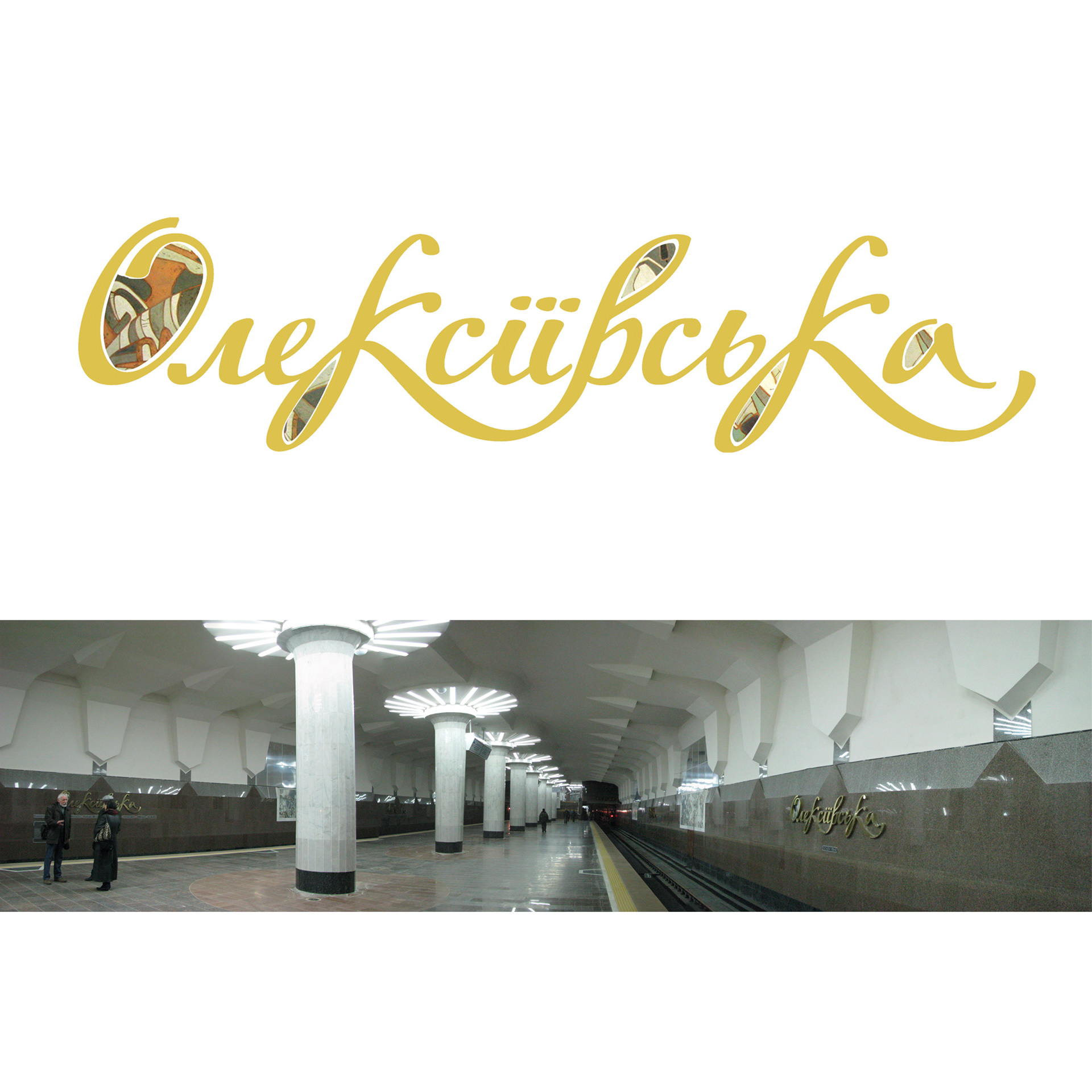
The shape and composition of the lettering expresses the idea and supports overall style of the ‘Oleksiivska’ metro station. It visually combines the decoration style and modern modification of traditional handwriting fonts. Traits characteristic for Ukrainian baroque, cursive, modern, are clearly noticeable here. But in the same time they are more of a replica of these famous typefaces, a kind of modern interpretation based on national traditions that serve to support the unanimous style of ‘Oleksiivska’ metro station interior.
The lettering outline is light, floating, associated with flying storks depicted in the panel (the panel was executed by the houred painters of Ukraine Igor Morgunov and Olga Erofeeva). Smooth lines of external elements resemble wings or floral shapes. The strokes contrast creates distinct colouration of letters elements due to saturation difference. Similar to the way the decorative panel composition is created by internal dynamics of colour, and black and white spots and lines, conventional movement and internal dynamics in the lettering appear gratefully to the color and change in elements direction, thus creating complex rhythm.
All mentioned above creates complete and harmonic composition, and inclusion of visual elements executed in copper and enamel techniques, creates finished image of ‘Oleksiivska’ metro station tunnel walls.
Client: KharkivMetrostroi, Kharkov, Ukraine
Year: 2010


http://2in1design.com.ua/portfolio/designs/201-oleksiivska-metro-station#sigProIda73f01723b