Its main concept is related to travelling, adventures and high fashion.
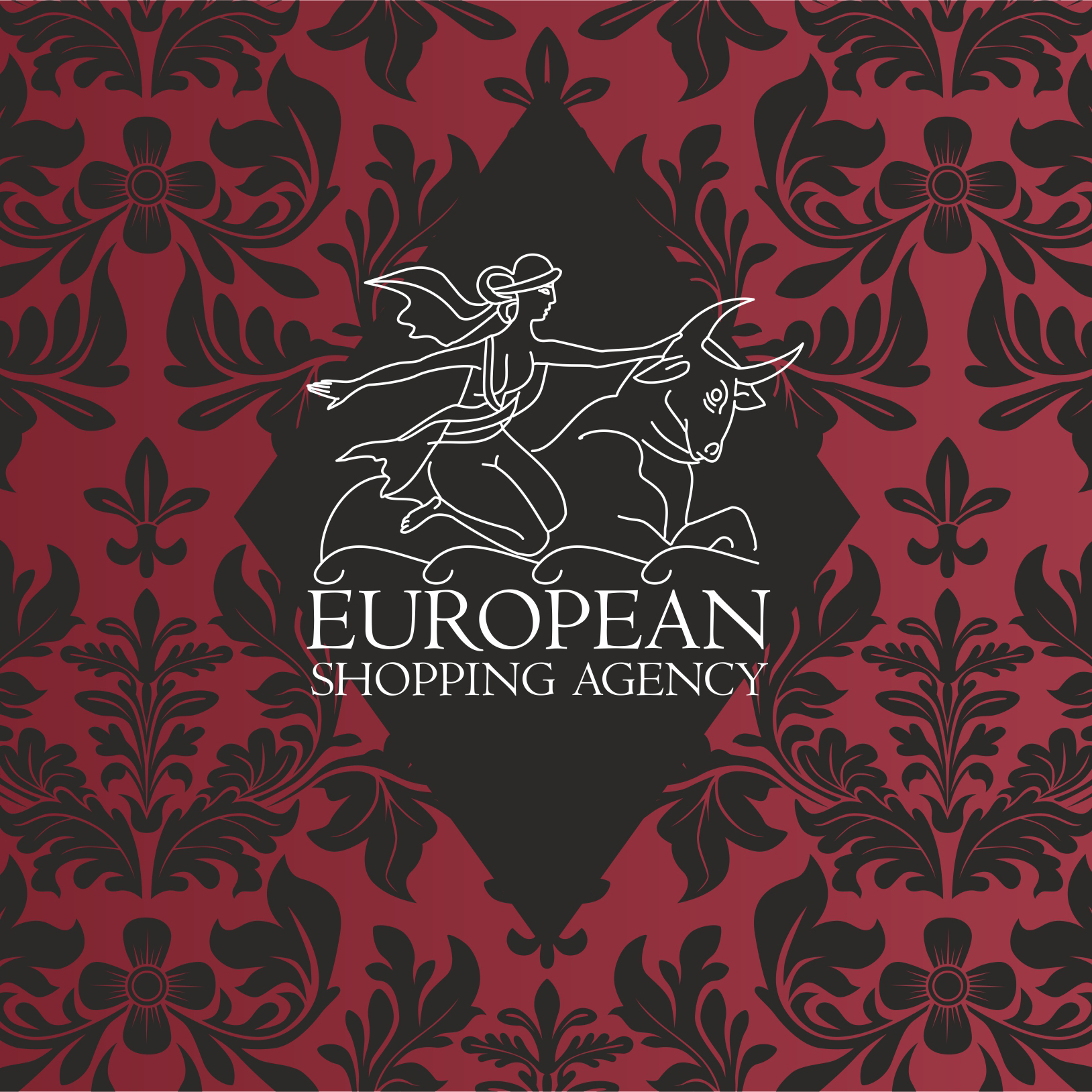
A Greek myth is used as a basis of the logo. The journey of Europa on the bull is a very romantic and fascinating story that inspired us to create this corporate identity.
The legend of Europa and Zeus begins when the ruler of the Olympian gods glimpses the young woman one day. At first sight of Europa, Zeus is instantly overcome by her beauty and grace. Not being one to ignore his desires, the god assumes the form of a glorious white bull and swims to the shore on which Europa and her female companions are playing. The bull is so sleek and handsome that the maidens all take turns stroking and petting the pretty creature.
In time, Europa feels comfortable enough with the bull to climb upon his back for a little ride. However, as soon as she is safely seated, the bull moves toward the sea, carrying the object of his affection with him. They together cross the water. Their strange but compelling journey leads them eventually to the island of Crete.
Upon arriving in Crete, Zeus finally casts off his disguise and reveals his divine identity to Europa. The mortal woman then becomes yet another of the god's lovers.
The logo forms an association with travelling and new experiences.
A pattern of Western European print is used to create additional elements. The pliable lines of ornamental flowers are smoothly combined with the softness of logo. The sharp contrast between black and white supplements the royal red which creates a feeling of grandiosity, refinement and exclusivity. Color pattern is used inside of black and white elements while colored lining in used in the strict black coat.
Client: European Shopping Agency, Kyiv
Year: 2015
Awards: Design and design International Awards, Favorite Design


http://2in1design.com.ua/portfolio/designs/223-branding-for-european-shopping-agency#sigProIdeaed22c43e