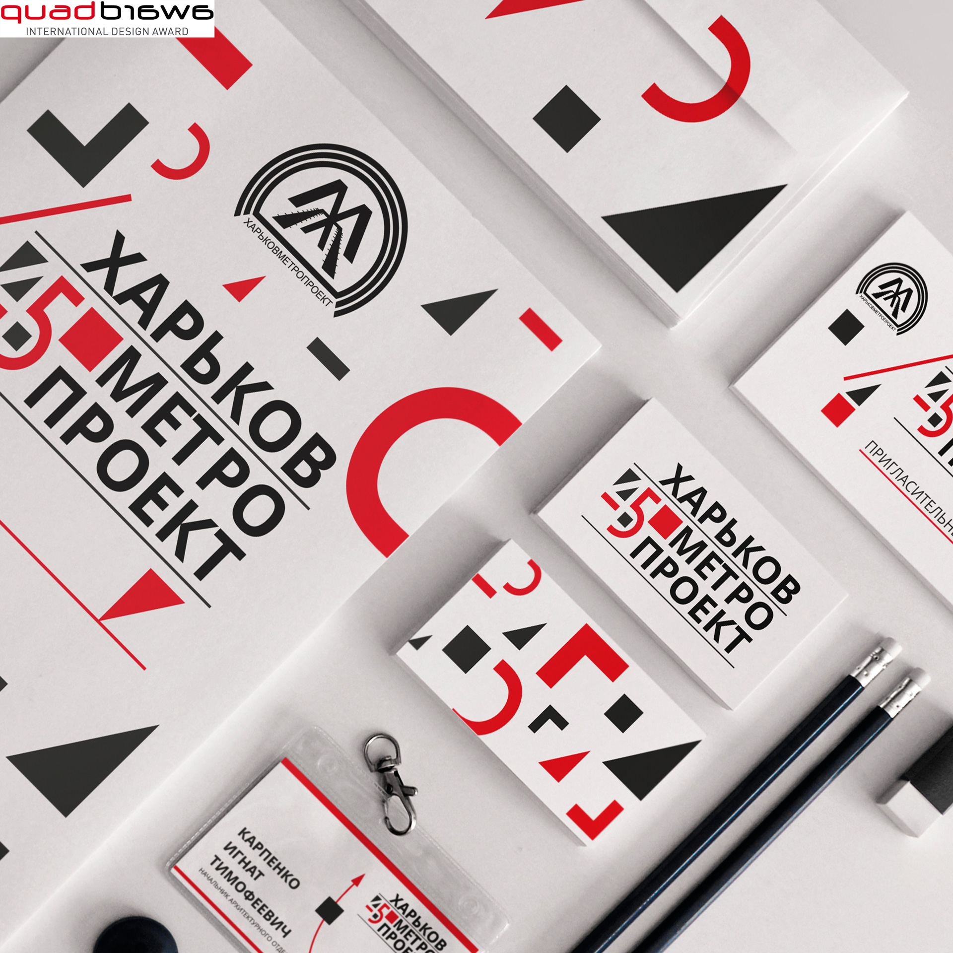
Today all the world textbooks on the History of Architecture study Kharkiv in ‘Constructivism’ chapter. As ‘Kharkovmetroproekt’, PJSC is an organisation that is directly connected with engineering we think that Constructivism style is the most concise one to show the image and the direction institution activity. Picked colors - red and black - are characteristic for the style. These colors also combine the corporate style elements and already existing catalogue so the overall set looks harmonic, in a single graphic and style.
Main elements are based on simple, concise shapes that highlight geometric forms purity which all architecture rests upon. Evaluation logo is formed from basic geometric shapes making a number 45.
Client: Harkovmetroproekt PJSC, 2013, Kharkiv, Ukraine
Year: 2013
Awards: Quadaward international design awards.
View the embedded image gallery online at:
http://2in1design.com.ua/index.php/pages/designs/197-kharkovmetroproekt#sigProId91a71d8ba9
http://2in1design.com.ua/index.php/pages/designs/197-kharkovmetroproekt#sigProId91a71d8ba9


